
In the fast-paced world of product management, interpreting Analytics data can make or break a strategy. This article dives into why sometimes, you need to step away from automated tools and draw your own funnel chart for deeper insights.
Imagine you’re the product manager at TubeTube, a fictional video platform. The CEO is focused on boosting user engagement, convinced it will lead to increased purchases since video sales drive the company’s revenue. A recent update that repositioned the 'like' button prominently saw a spike in likes.
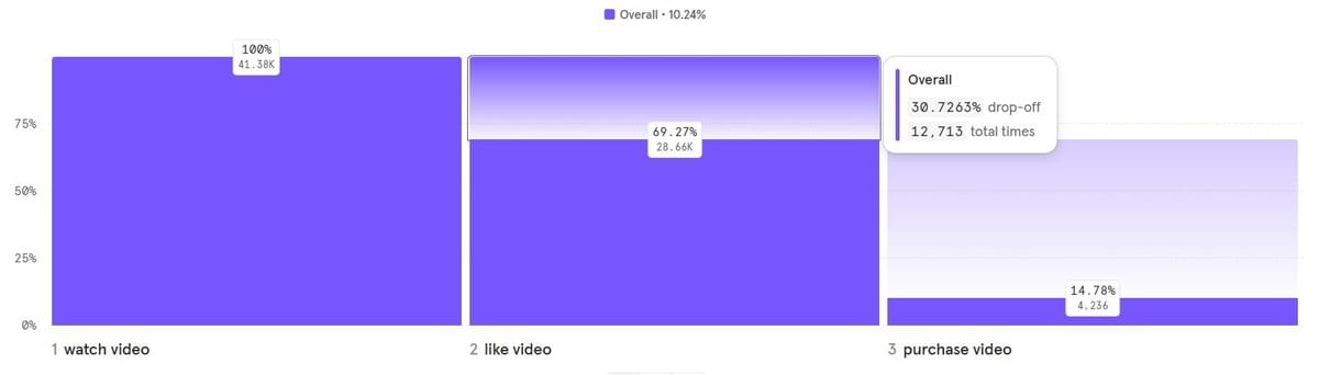
Since the feature deployment, your Analytics are showing this funnel:
")
A basic interpretation of the chart would be that - of those watching videos, at some point, a whopping 69% ‘like’ a video. Of those, almost 15% convert to eventually purchasing a video.
At first glance, it seems intuitive to assume that more 'likes' translate to higher engagement and subsequently more purchases. But do your Analytics provide the evidence to support this assumption?
Advanced Analytics users might tell you to use the ‘exclude step’ feature some tools such as Mixpanel offer. When we update our chart it looks like this:
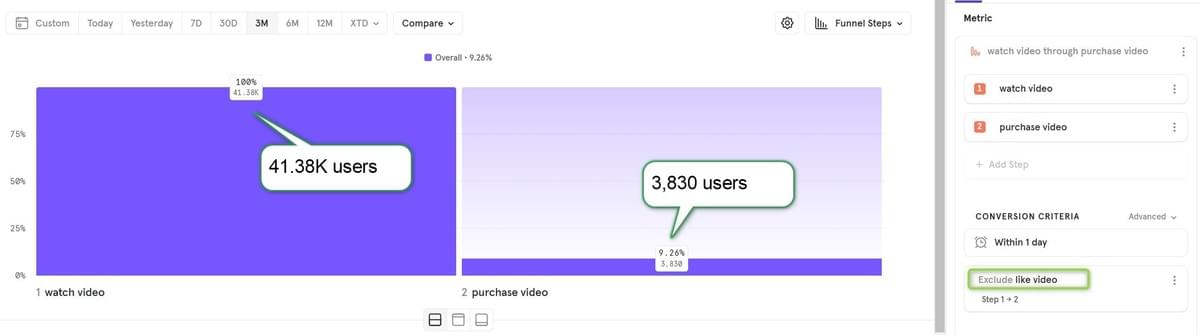
A common interpretation of this chart would be that - of those watching videos, excluding those who at any point ‘liked’ a video, only 9% converted to purchasing a video. This could lead to the conclusion that - ‘likes’ are increasing conversion from 9% to 15%, which is quite significant (66% relative increase). Which is very good of course.
However, I argue the opposite. What we really need to measure is how many users who didn’t ‘like’ a video still went on to make a purchase. It may sound similar, but the distinction is crucial.
Out of all users, 69% ‘liked’ a video, meaning 31% did not. Of those, we need to know how many ended up still converting to purchase. But Mixpanel doesn’t give us an ‘out-of-the-box’ way to view that. We need to take out our calculators and punch in numbers:
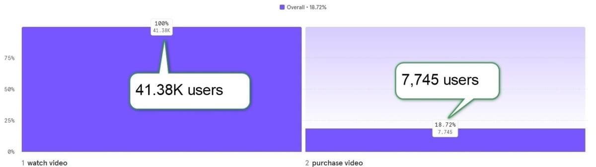
1. To find out how many users converted without any middle-step constraints, remove the intermediary step and look at the updated funnel chart:
2. Next, calculate the number of users who didn’t ‘like’ a video (12,713):
3. From the total number of users who purchased (7,745), subtract those who purchased after 'liking' (4,236). This gives you 3,509 users who purchased without 'liking:
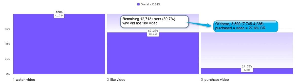
4. The result? Of the 30.7% who didn’t ‘like’ a video, 27.6% still converted to a purchase. This rate is nearly double the 14.8% conversion of those who did 'like' a video!
My goal here is to highlight this common misinterpretation and demonstrate why there isn’t a straightforward solution available — yet.
For those asking why the initial approach is wrong - by excluding a middle step we don’t change the first step numbers. That resulted in us dividing 3,509 out of 41.38K (all users who watched videos) = 9%, instead of dividing the number by 12,713 (who are those who watched, but never liked).
Did this ever happen to you? Don’t agree with me?
Comment below or talk to us.
In a future article we’ll discuss different approaches and ways to extract this crucial.
About the Author
Yoav Yechiam is a globally recognized expert in Behavioral Analytics. He serves as the managing partner at The Product Alliance, a strategic consulting firm. They have recently launched the GPT-powered 🤖 Analytics Advisor Bot, to help product managers select the right Analytics tools. Try it now for free and simplify your Analytics journey.